Known for her bright pops of color and imaginative setups, Kansas City, Missouri-based still life shooter Juj Winn tells PDN what went into the making of her 2018 Photo Annual award-winning stock photos.
Note: PDN’s Photo Annual is now open for entries for 2019. Visit www.pdnphotoannual.com to learn more and enter.
PDN: These images won in the stock category for the 2018 Photo Annual. Did you create the setups specifically for stock licensing?
Juj Winn: While I do submit most images for stock, I rarely set out to shoot stock specifically. Instead, I like to go into the studio with a prop or a rough concept and see what happens. I’ll move things around asking, “What if this? What if that?” until I’ve exhausted the possibilities.
PDN: What was the creative concept you had in mind for the shoot?
JW: The images chosen for the PDN Photo Annual were actually from two different shoots.
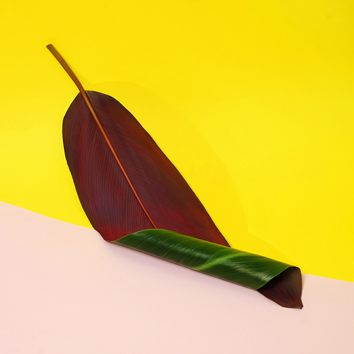
The curled leaf image was the result of an exploration involving color blocking and that beautiful leaf. I had gone to the florist looking for monstera leaves but they were out so I brought home the banana leaf instead. I liked the contrast of the colors from the front to the back and thought the simple graphic shape might be interesting to play with. When it comes to props you never know if you’re going to be able to get exactly what you have in mind so I find it’s really helpful to being open to improvising.
I knew I wanted to use a color blocked background, but the curl came about from a desire to show both colors of the leaf in the same image. In hindsight I probably should have bought two leaves, but I didn’t think of it at the time. Happy accident!
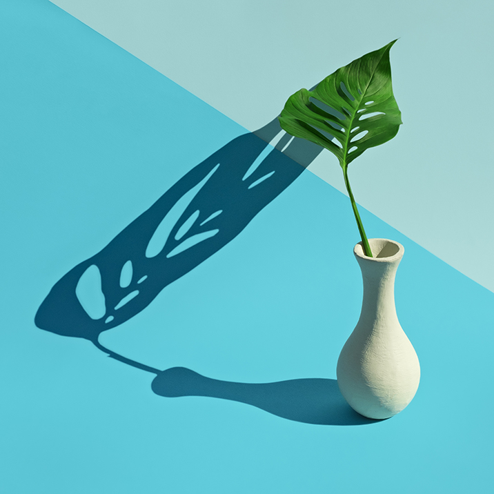
The leaf in the vase image was the result of a lighting test I was doing for an upcoming shoot for a client. I hadn’t received their product yet so used the vase as a stand in. I loved the drama of the strong shadow and the way it became almost another prop in the composition, but originally I wasn’t happy with how static the image was. I thought it would be more interesting if the shadow didn’t just fall in a straight line away from the leaf so I curved the background paper up behind it to add some movement.
PDN: Can you describe the lighting used for the shoot?
JW: For the lighting on the banana leaf, I used a combination of fluorescents in a large soft box and a silver reflector. I enhanced the shadow in Photoshop to give it a little more punch.
For the vase image, the lighting was direct overhead sun on a hot summer day. Being in the midwest where the weather is very unpredictable I can’t depend on being able to work outside, so I don’t shoot this way very often. Working with strong sun was both a treat and a challenge. I liked the intensity of the contrasts and the immediacy of seeing how subtle changes in composition affected the shadows, but the heat is hard on props and the sun moves fast—you have to be able to work quickly.
Working this way requires a certain amount of “letting go.” There has to be a trust in your abilities and your vision—and that’s good for someone like me who tends to be a bit of control freak. I was really pleased with the way this shot came together and it reminded me how often I wish I could spend more time shooting somewhere like California or Arizona.
PDN: The color palette and style is very reflective of your personal brand. Can you describe that look in your own words, and briefly tell us how this signature palette has come to be?
JW: People are always asking about my color palette, and honestly, I don’t really have a good answer for how things came about. I’ve always liked bright color, and if you look at my Instagram you will notice there is a lot of pink. But if you scroll back, you will find that things used to be much different. I used to shoot primarily on black or white. I liked the simplicity of it and the way it put the subject of the image front and center. But, one day, I brought home a roll of pink paper and the more I started working with it, the more I realized it really is a great neutral. Sometimes I think it might be time to change it up—but hey, Pantone just picked another pink for color of the year so maybe I’ll wait awhile!
PDN: What do you like most about these two images?
JW: I think my favorite part of these images is how simple they are. Sometimes I have a tendency to get in my own way and overcomplicate things. But these two images are great examples of times I was able to let the props speak for themselves.
PDN: And lastly, what gear did you use?
JW: These were both shot with a Fuji XT1 and an XF 35mm f/1.4 lens.
Related Articles
Creating the Illusion of Speed
A Quite Contemplation on Hanoi
Clever, Colorful, Conceptual Still-Life